Mission

Macro Design – Brand Development

Swedish company Macro Design creates high-quality bathroom furniture and showers with thoughtful design for the Nordic market. We have been given the exciting task of guiding the company on its ongoing brand journey. The next step is designing and writing content for a new website.

Challenge

Macro Design has evolved from manufacturing showers to focusing on entire bathrooms. Sales are made through retailers and installers, as well as through wholesalers. However, the competition in the bathroom trade is fierce. And as more and more business is conducted without physical presence, increased visibility and greater brand awareness among end customers is required.

Solution

We chose to elevate the brand and focus on what Macro Design stands for - innovation, function, and design. With the client we developed a weighty inspirational catalog, a clearer tone of voice, and several more elaborate visualizations to showcase the quality of the products and convey the essence of the brand.

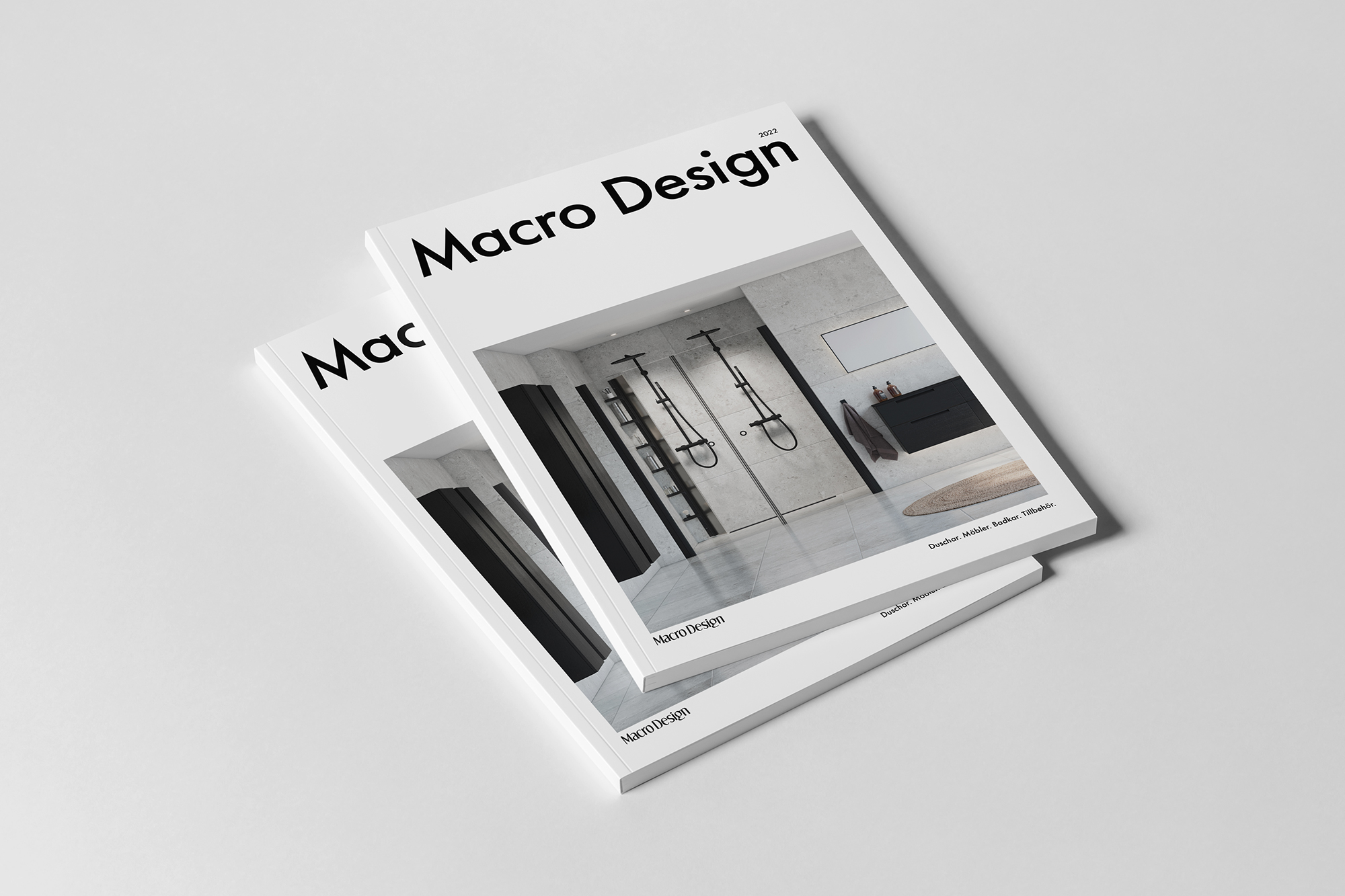
566 grams of pure inspiration

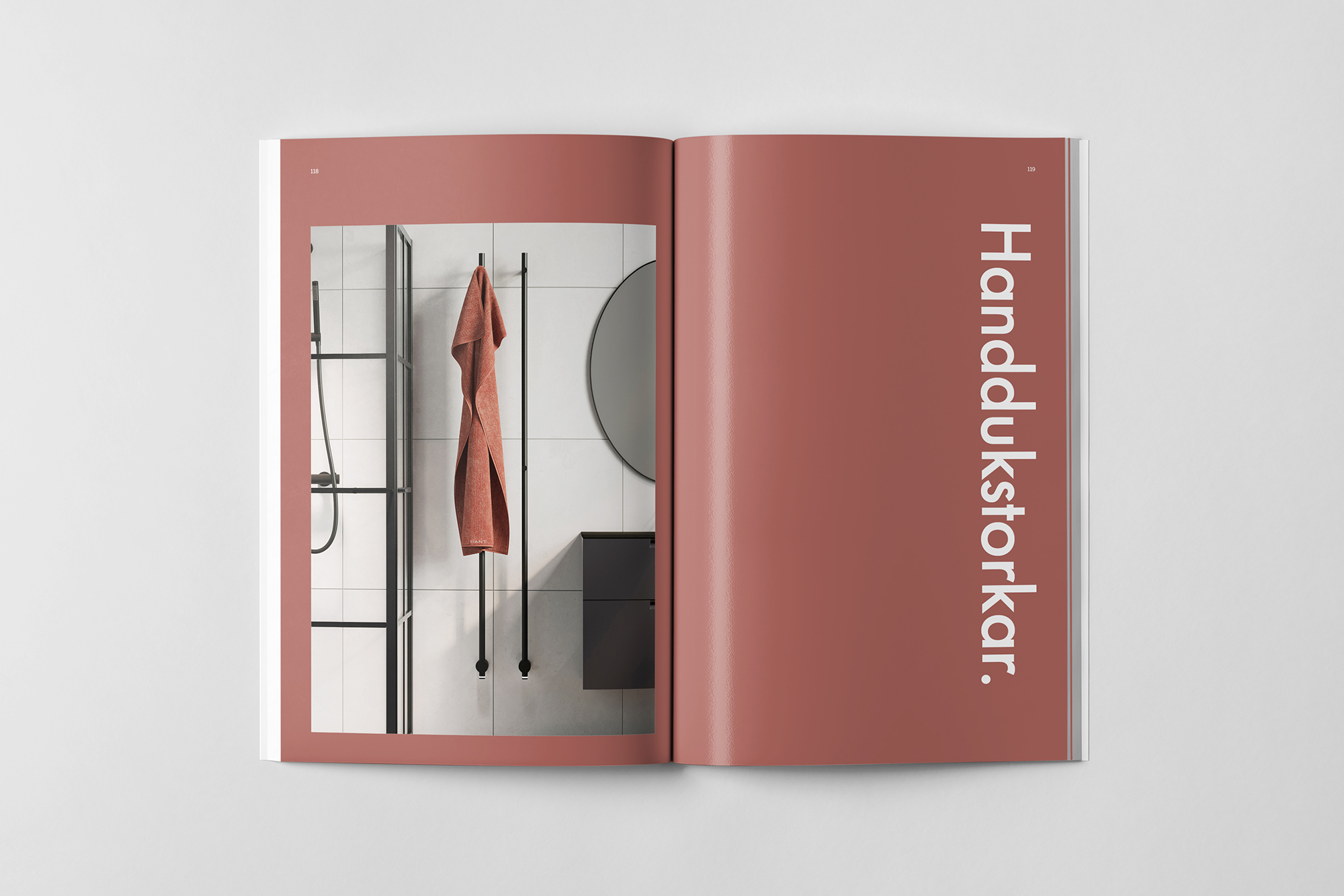
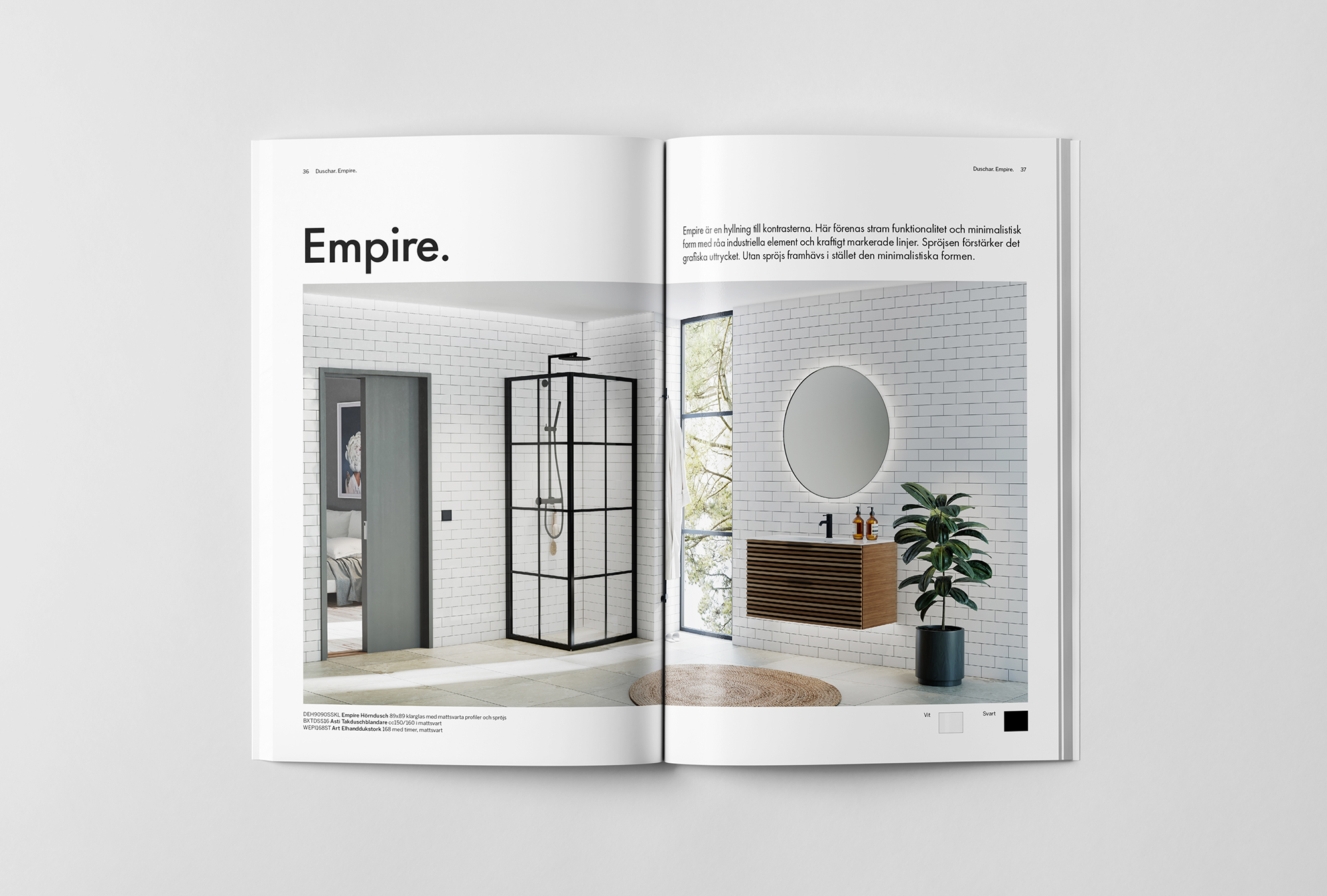
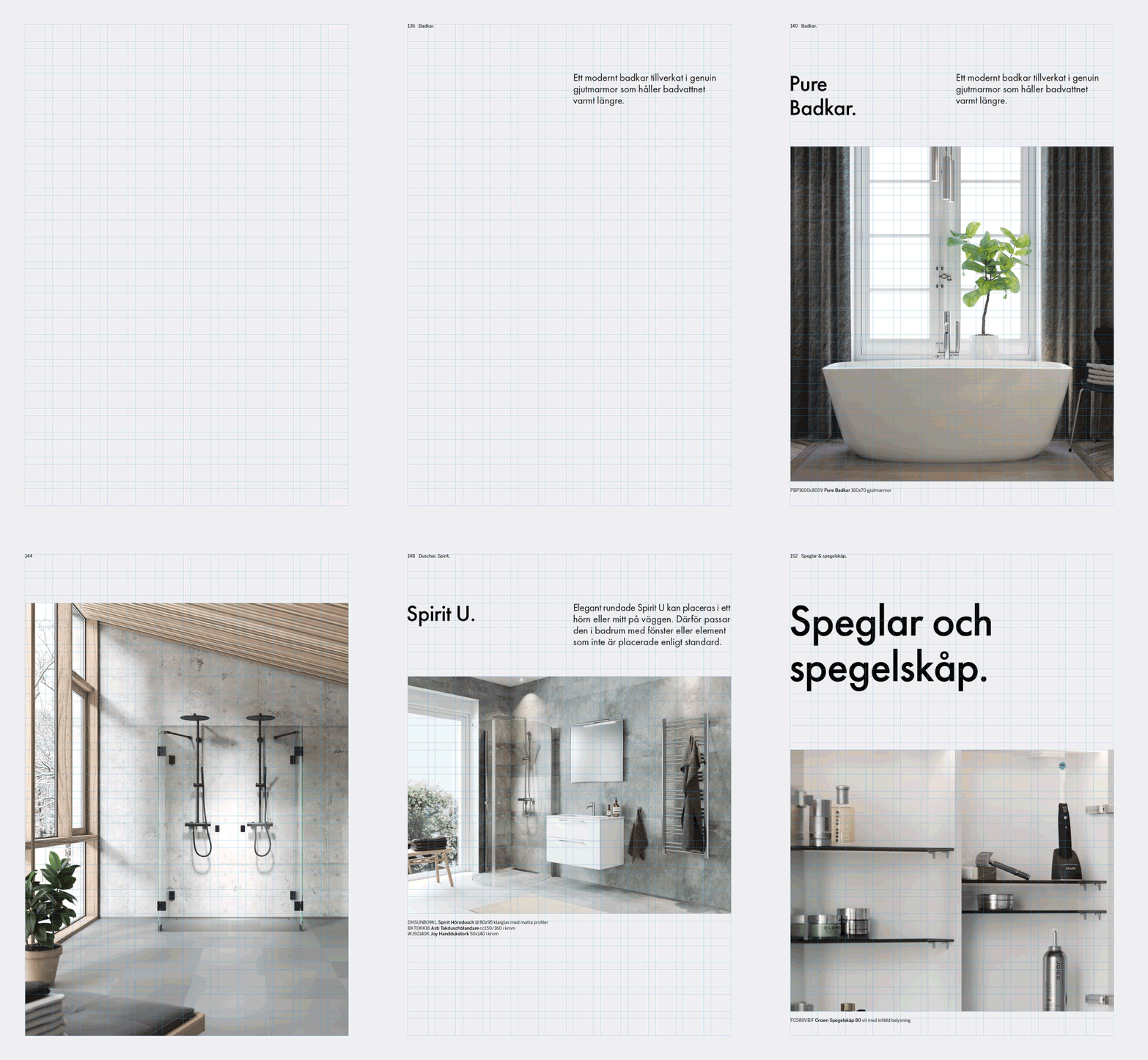
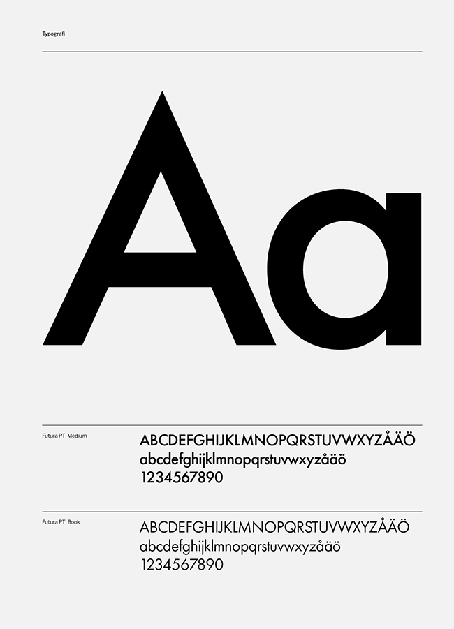
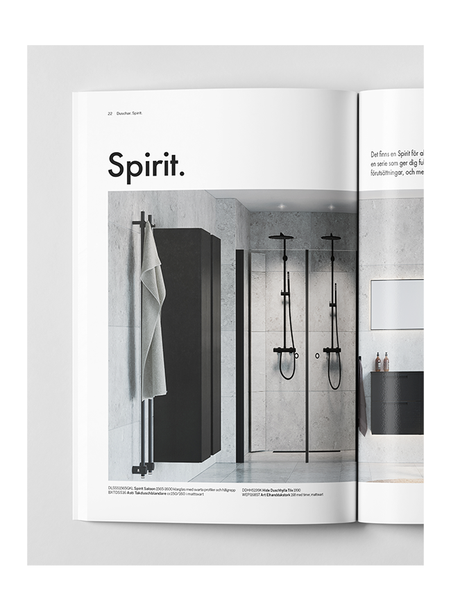
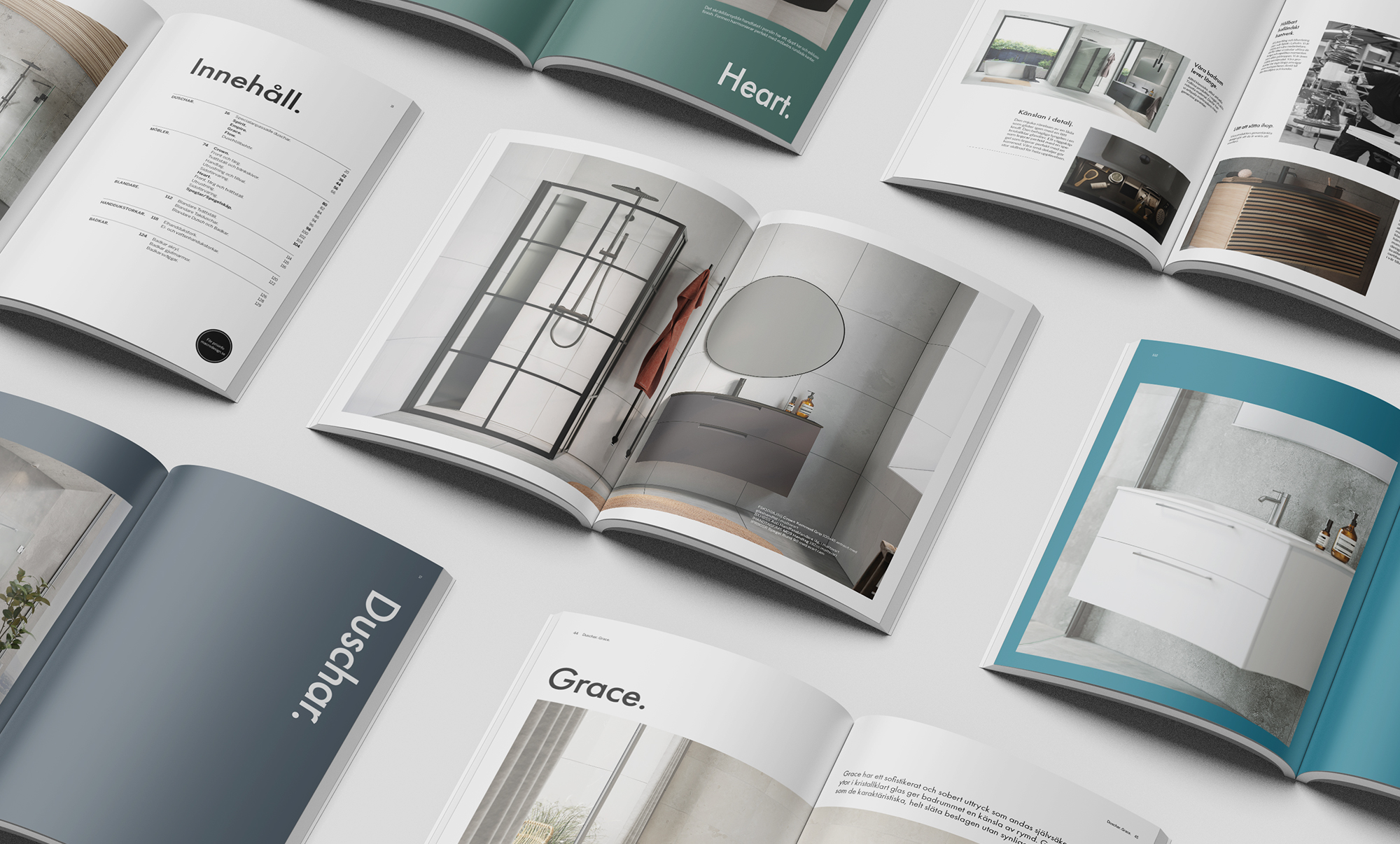
In this year’s catalog, the white background creates a sense of calm, and the paper feels pleasant to touch. Clear chapter divisions and a new heading font with more character guide the reader through the 132 pages. An underlying grid provides layout structure and leads the eye.

The environments in the new catalog are rooms that open up and invite the reader to linger. The feeling is peaceful and satisfying. Furniture and showers take center stage. Details are highlighted and reviewed, materials and colors are displayed up close.

Tone of Voice

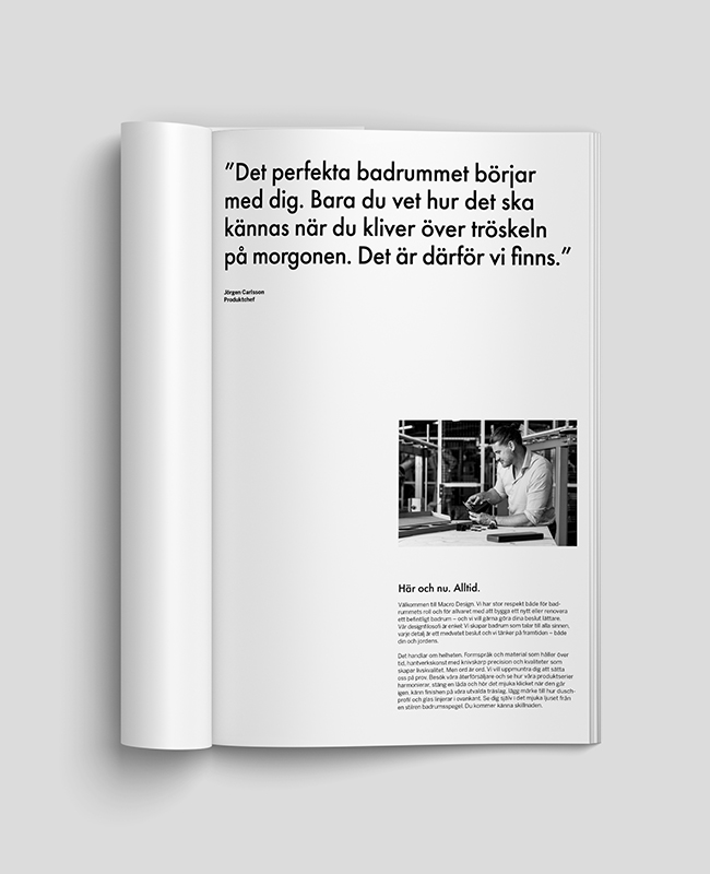
Macro Design has acquired a tone of voice that matches the company’s design philosophy. We speak to all senses and choose our words carefully. When describing the products, we aim to convey a feeling. However, conveying emotions and telling someone exactly how to feel are different things. We leave space for silence to speak to people’s imagination.

Visualizations

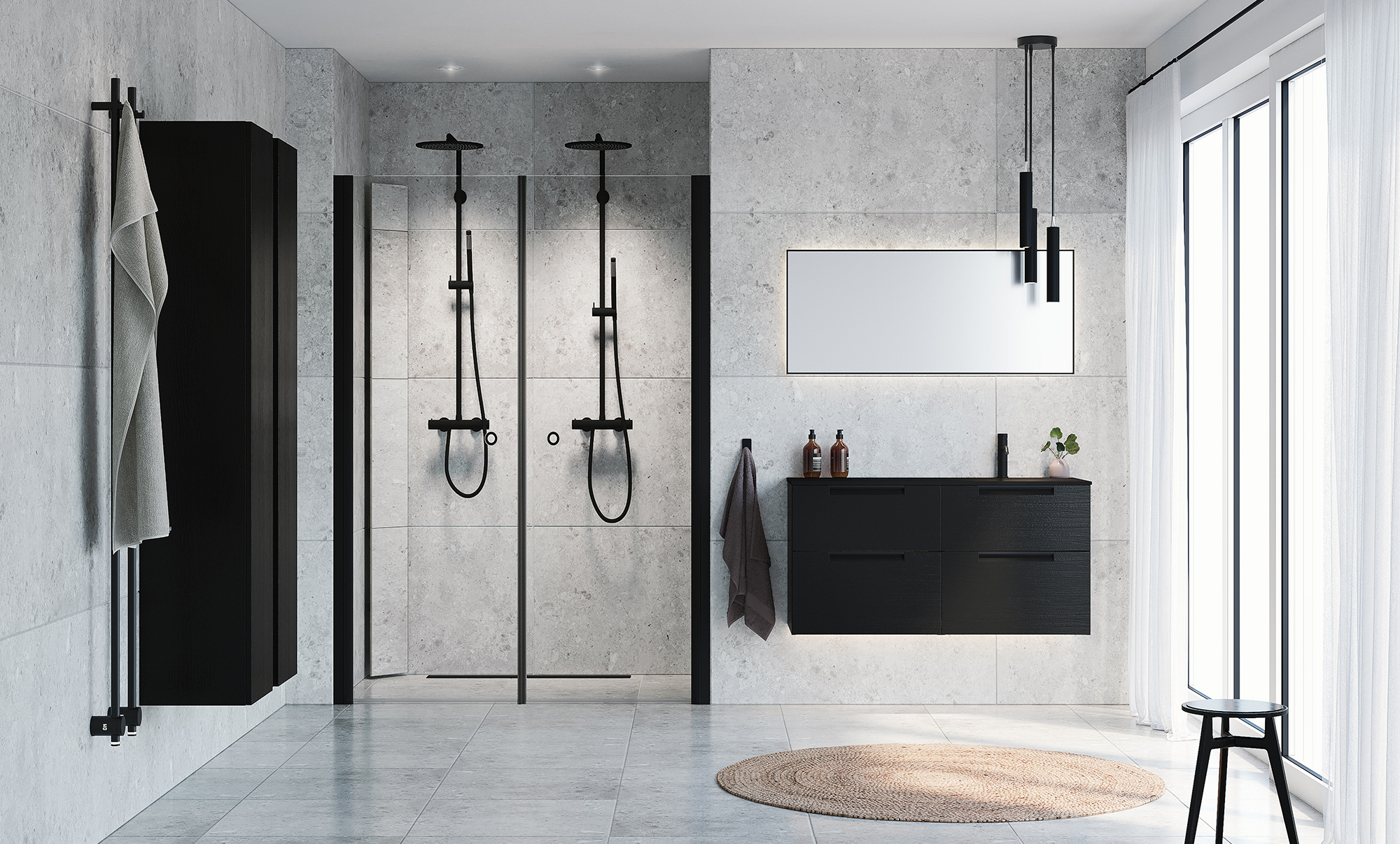
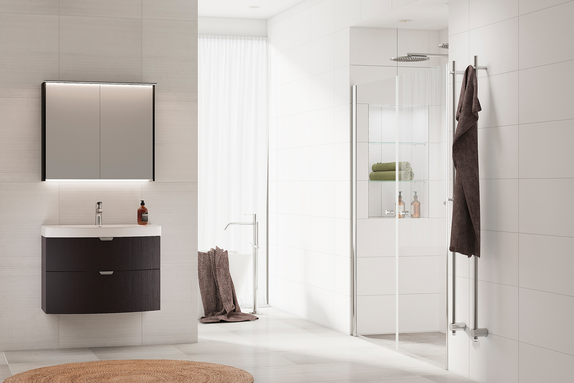
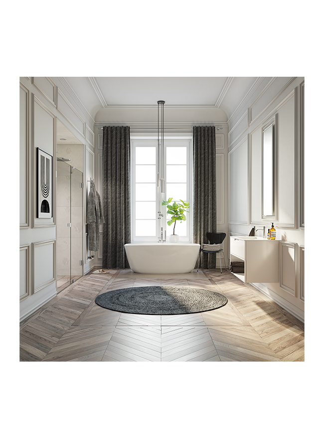
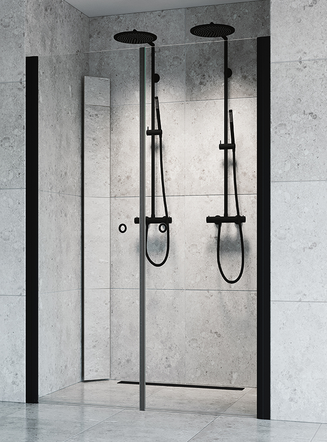
Macro Design creates bathrooms that last, and we wanted it to feel authentic. In the new visualizations, focus is on the products. The environments are calm, the colors sober, and the interior details few and carefully selected. The feeling is minimalistic and Scandinavian. It could be at home, in an apartment in Stockholm, a villa in Bergen, a summer residence in the archipelago…